An Investigation for Determining the Optimum Length of Chopsticks : A case for Single-Factor Repeated Measures ANOVA.

Standard

In the pursuit to determine the optimum length of chopsticks, two laboratory studies were conducted, using a randomised complete block design, to evaluate the effects of the length of the chopsticks on the food-serving performance of adults and children. Thirty-one male junior college students and 21 primary school pupils served as subjects for the experiment.The response was recorded in terms of food-pinching efficiency (number of peanuts picked, and placed in a cup).

Data source https://www.udacity.com/api/nodes/4576183932/supplemental_media/chopstick-effectivenesscsv/download

The data was read in using read.csv() and allotted appropriate column names.

stick<-read.csv(file.choose(),header = TRUE,stringsAsFactors = FALSE)
chop<-stick
names(chop)<-c("Efficiency","Individual","Length")


Next, we’ll convert  the ‘Length’ and ‘Individual’ to factors and the dependent variable ‘Efficiency’ to numeric to carry out our repeated measures ANOVA analysis.

chop$Efficiency<-as.numeric(chop$Efficiency)
chop$Length<- factor(chop$Length)
chop$Individual<-factor(chop$Individual)

Let’s use the tapply() to find out the mean pinching efficiency grouped by the chopstick length and plot the result.

group_mean<-tapply(chop$Efficiency,chop$Length,mean)

plot(group_mean,type="p",xlab="Chopstick Length",ylab="Mean Efficiency",
 main="Average Food Pinching Efficiency \n by Chopstick Length",col="green",pch=16)

Rplot05.png


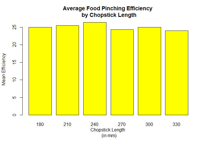
Visually, we can see that the efficiency grows steadily from 180 mm through to the 240  and then falling sharply at 270 mm and despite a slight increase at 300,it continues to fall at 330.

Before we can perform the repeated measures ANOVA, we will need to check for the Sphericity which assumes the homogeneity of variance among differences between all possible pairs of groups. This is done by the Mauchly’s test.

chop1<- cbind(chop$Efficiency[chop$Length==180],
 chop$Efficiency[chop$Length==210],
 chop$Efficiency[chop$Length==240],
 chop$Efficiency[chop$Length==270],
 chop$Efficiency[chop$Length==300],
 chop$Efficiency[chop$Length==330])

mauchly.test (lm (chop1 ~ 1), X = ~1)


> mauchly.test (lm (chop1 ~ 1), X = ~1)

           Mauchly's test of sphericity
           Contrasts orthogonal to
           ~1


data: SSD matrix from lm(formula = chop1 ~ 1)
W = 0.43975, p-value = 0.05969

Since, (thankfully!) the p-value is >0.05, the homogeneity of variance assumption holds and no further adjustment is necessary.

We can now get on with the repeated measures ANOVA.

aov.chop = aov(Efficiency~Length + Error(Individual/Length),data=chop)
summary(aov.chop)

Error: Individual
 Df Sum Sq Mean Sq F value Pr(>F)
Residuals 30 2278 75.92 

Error: Individual:Length
         Df Sum Sq Mean Sq F value Pr(>F) 
Length    5   106.9 21.372   5.051 0.000262 ***
Residuals 150 634.6 4.231 
---
Signif. codes: 0 ‘***’ 0.001 ‘**’ 0.01 ‘*’ 0.05 ‘.’ 0.1 ‘ ’ 1

The F-ratio is 5.051 and p-value is 0.000262 which means there is significant effect of the length of the chopstick on the eating efficiency.

Since, the F-ratio is significant , we can now process the post-hoc analysis to perform pair-wise comparisons.

1. Holm’s adjustment

with(chop,pairwise.t.test(Efficiency,Length,paired=T))

> with(chop,pairwise.t.test(Efficiency,Length,paired=T))

 Pairwise comparisons using paired t tests 

data: Efficiency and Length 

      180 210   240   270    300 
210 1.000 - - - - 
240 0.323 1.000 - - - 
270 1.000 0.034 0.035 - - 
300 1.000 1.000 0.198 1.000 - 
330 0.630 0.048 8.1e-05 1.000 0.435

P value adjustment method: holm

2. Bonferroni adjustment

with(chop,pairwise.t.test(Efficiency,Length,paired=T,p.adjust.method="bonferroni"))

> with(chop,pairwise.t.test(Efficiency,Length,paired=T,p.adjust.method="bonferroni"))

 Pairwise comparisons using paired t tests 

data: Efficiency and Length 

       180 210 240 270 300 
210 1.000 - - - - 
240 0.485 1.000 - - - 
270 1.000 0.036 0.040 - - 
300 1.000 1.000 0.269 1.000 - 
330 1.000 0.060 8.1e-05 1.000 0.725

P value adjustment method: bonferroni

As we can see, the Bonferroni adjustment inflates the p-values as compared to Holm’s adjustment.

3. Treatment-by-Subjects

Another method which can be employed is the Treatment-by-Subjects i.e. as a 2 factor design without interaction , without replication. The advantage of this approach is that it allows us to employ the TukeyHSD() post-hoc .


aov.chop1 = aov(Efficiency ~ Length + Individual, data=chop)
summary(aov.chop1)

> summary(aov.chop1)
         Df   Sum Sq Mean Sq     F value Pr(>F) 
Length     5   106.9       21.37 5.051    0.000262 ***
Individual 30 2277.5       75.92 17.944   < 2e-16 ***
Residuals 150 634.6 4.23 
---
Signif. codes: 0 ‘***’ 0.001 ‘**’ 0.01 ‘*’ 0.05 ‘.’ 0.1 ‘ ’ 1
> 

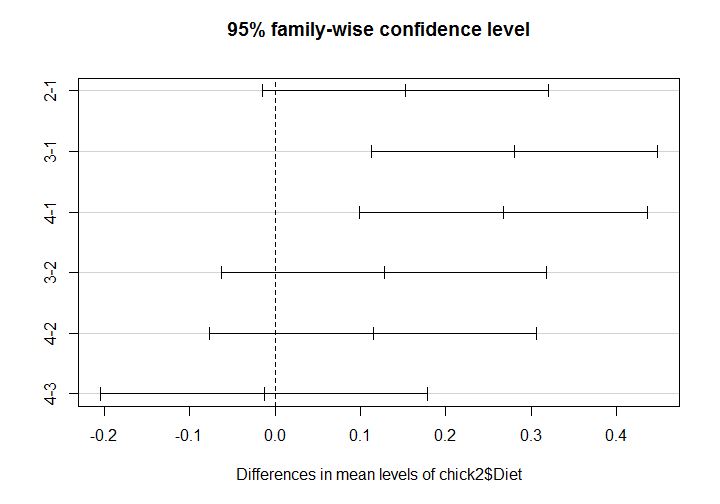
TukeyHSD(aov.chop1,which="Length")

> tukey
 Tukey multiple comparisons of means
 95% family-wise confidence level

Fit: aov(formula = Efficiency ~ Length + Individual, data = chop)

$Length
           diff        lwr       upr        p adj
210-180 0.54870968 -0.9595748 2.05699418 0.8999148
240-180 1.38774194 -0.1205426 2.89602644 0.0904885
270-180 -0.61129032 -2.1195748 0.89699418 0.8503866
300-180 0.03290323 -1.4753813 1.54118773 0.9999999
330-180 -0.93548387 -2.4437684 0.57280063 0.4749602
240-210 0.83903226 -0.6692522 2.34731676 0.5959492
270-210 -1.16000000 -2.6682845 0.34828450 0.2346843
300-210 -0.51580645 -2.0240910 0.99247805 0.9213891
330-210 -1.48419355 -2.9924781 0.02409096 0.0565555
270-240 -1.99903226 -3.5073168 -0.49074775 0.0025803
300-240 -1.35483871 -2.8631232 0.15344579 0.1053005
330-240 -2.32322581 -3.8315103 -0.81494130 0.0002412
300-270 0.64419355 -0.8640910 2.15247805 0.8199855
330-270 -0.32419355 -1.8324781 1.18409096 0.9893780
330-300 -0.96838710 -2.4766716 0.53989741 0.4349561

By studying the difference between the means and the Tukey adjusted p-value, the most significant diff is between the groups 240-330 , with a mean difference of 2.32.


Conclusion:

The results show that the food-pinching performance is significantly affected by the length of the chopsticks, and that chopsticks of about 240 mm long performed the best.


Beauty is talent: A case for 2-way ANOVA.

Standard

Dataset:

halo1.dat

Source:

Landy and Sigall (1974). “Beauty is Talent: Task Evaluation as a Function of the Performer’s Physical Attraction,” Journal of Personality and Social Psychology, 29:299-304.

60 male undergraduates read an essay supposedly written by a female college freshman. They then evaluated the quality of the essay and the ability of its writer on several dimensions. By means of a photo attached to the essay, 20 evaluators were led to believe that the writer was physically attractive and 20 that she was unattractive. The remaining evaluators read the essay without any information about the writer’s appearance. 30 evaluators read a version of the essay that was well written while the other evaluators read a version that was poorly written. Significant main effects for essay quality and writer attractiveness were predicted and obtained.

Description:

Two Factor experiment to assess if appearance effects  judgment of student’s essay.             Appearance (Attractive/Control/Unattractive) and Essay Quality (Good/Poor) are factors (Pictures given with essay, except in control).

Response:

Grade on essay. Data simulated to match their means and standard deviations.

Variables/Columns:
Essay Quality 8 /* 1=Good, 2=Poor */
Student Attactiveness 16 /* 1= Attractive, 2=Control, 3=Unattractive */
Score 18-24


When we import halo.dat using read.delim() ,we get a single  column V1 containing all the data values. The separation of V1 into 3 distinct columns and other subsequent transformations are done using functions from the very handy dplyr package, as shown below.

hal<-read.delim(file.choose(),header = FALSE,stringsAsFactors = FALSE)
halo<-separate(halo,V1,c("sno","quality","attractiveness","score","dec"))
halo<-unite(halo,scoretotal,score:dec,sep=".")
halo<- select(halo,2:4)

Next we’ll convert the 2 independent variables (Essay Quality, Attractiveness) to factors and the dependent variable (Score) to numeric to carry out our ANOVA analysis.

halo$scoretotal<-as.numeric(halo$scoretotal)
halo$quality<-factor(halo$quality)
halo$attractiveness <- factor(halo$attractiveness)

We can test 3 hypotheses:

1. Are scores higher for more attractive students ?
2. Are scores higher for higher quality essay?
3. Whether student attractiveness and essay quality interact resulting in higher scores?

Let’s start by look at the means of our groups. Here, we will use the tapply() function to generate a table of means and use the results to plot a graph.

halo_mean<-tapply(halo$scoretotal,list(halo$attractiveness,halo$quality),mean)

# Plot a bar-plot
barplot(halo_mean, beside = TRUE, 
 col = c("orange","blue","green"), 
 main = "Mean Scores", 
 xlab = "Essay Quality", 
 ylab = "Score")

# Add a legend
legend("topright", fill = c("orange","blue","green"), 
 title = "Attractiveness",c("1","2","3"),
 cex=0.5)

> halo_mean
    1       2
1 17.900 14.899
2 17.900 13.400
3 15.499 8.701

Rplot03

Visually, we can see that for a good quality essay,the students were evaluated most favorably when they were attractive or when their appearance was unknown , least when they were unattractive.For a poor grade essay,the students were evaluated most favorably when they were attractive, least when they were unattractive, and intermediately when their appearance was unknown.

Let’s explore and further refine our study by performing a 2-way ANOVA. But before we do that, we need to test the homogeneity of the variance assumption.The assumption must hold for the results of an ANOVA analysis to be valid.

leveneTest(halo$scoretotal~halo$quality*halo$attractiveness)

The result gives us a p-value of 0.2989 which means that the assumption of homogeneity of variance holds. There is not a significant difference in the variances across the groups.

And now for the ANOVA.

aov_halo<-aov(halo$scoretotal~halo$quality*halo$attractiveness)
summary(aov_halo)

> summary(aov_halo)
                                    Df Sum Sq Mean Sq F value Pr(>F) 
halo$quality                         1   340.8  340.8 17.231   0.000118 ***
halo$attractiveness                  2   211.0 105.5  5.335    0.007687 ** 
halo$quality:halo$attractiveness     2    36.6  18.3  0.925    0.402832 
Residuals                           54  1067.9  19.8 
---
Signif. codes: 0 ‘***’ 0.001 ‘**’ 0.01 ‘*’ 0.05 ‘.’ 0.1 ‘ ’ 1

The very low p-values of quality and attractiveness indicate high significance of these 2 factors independently to drive the higher scores. But the high p-value of the interaction shows that both together do not drive higher scores.Since,we do not have a significant interaction effect , we do not need to follow it up to see exactly where the interaction is coming from.


We can now proceed with Post-hoc analysis to test the main effect pairwise comparisons via the following  methods:

  1. TukeyHSD
  2. pairwise.t.test()
  3. Bonferroni Adjustment
  4. Holm’s adjustment


Pair -wise comparison using TukeyHSD

TukeyHSD(aov_halo,"halo$quality")
> TukeyHSD(aov_halo,"halo$quality")
  Tukey multiple comparisons of means
    95% family-wise confidence level
Fit: aov(formula = halo$scoretotal ~ halo$quality * halo$attractiveness)
$halo$quality
      diff      lwr        upr     p adj
2-1 -4.766333 -7.068384 -2.464282 0.0001182

By studying the difference between the means and the Tukey adjusted p-value, ,GoodQ_mean-PoorQ_mean = 4.77 | p-value = 0.0001182
The mean score is higher for more good quality essays than for poor quality essays.

TukeyHSD(aov_halo,"halo$attractiveness")
> TukeyHSD(aov_halo,"halo$attractiveness")
 Tukey multiple comparisons of means
 95% family-wise confidence level
Fit: aov(formula = halo$scoretotal ~ halo$quality * halo$attractiveness)
$halo$attractiveness
      diff      lwr      upr      p adj
2-1 -0.7495 -4.138616 2.6396163 0.8555096
3-1 -4.2995 -7.688616 -0.9103837 0.0095632
3-2 -3.5500 -6.939116 -0.1608837 0.0381079

By studying the difference between the means and the Tukey adjusted p-value, ,
Attractive_mean – Control_mean = 0.75 | p-value = 0.8555096
Attractive_mean – Unattractive_mean = 4.99 | p-value = 0.0095632
Control_mean – Unattractive_mean = 3.55 | p-value = 0.0381079

The mean score is higher for more attractive people than for unattractive people (The halo affect).


Pairwise comparison using pairwise.t.test()

pairwise.t.test(halo$scoretotal, halo$attractiveness, p.adj = "none")
> pairwise.t.test(halo$scoretotal, halo$attractiveness, p.adj = "none")

 Pairwise comparisons using t tests with pooled SD 

data: halo$scoretotal and halo$attractiveness 

   1       2 
2 0.6397 - 
3 0.0091 0.0297

P value adjustment method: none 
> 

With no adjustments, the Attractive-Unattractive (1-3) and Control-Unattractive (2-3) comparison are statistically significant,whereas, the Attractive-Control (1-2) comparison is not.This suggests that both the attractive and control groups scored superior to the Unattractive group, but that there is insufficient statistical support to distinguish between the Attractive and Control groups.


pairwise.t.test(halo$scoretotal, halo$quality, p.adj = "none")
> pairwise.t.test(halo$scoretotal, halo$quality, p.adj = "none")

 Pairwise comparisons using t tests with pooled SD 

data: halo$scoretotal and halo$quality 

    1 
2 0.00027

P value adjustment method: none 
> 

With no adjustments, the Good Quality-Poor Quality (1-2) comparison is statistically significant. This suggests that good quality essays scored superior as compared to the poor quality essay group.


Pairwise comparison using Bonferroni adjustment

The Bonferroni adjustment simply divides the Type I error rate (.05) by the number of tests (in this case, three for attractiveness and 2 for essay quality). Hence, this method is often considered overly conservative. The Bonferroni adjustment can be made using p.adj = “bonferroni” in the pairwise.t.test() function.

pairwise.t.test(halo$scoretotal,halo$attractiveness,p.adj = "bonferroni")
> pairwise.t.test(halo$scoretotal,halo$attractiveness,p.adj = "bonferroni")

 Pairwise comparisons using t tests with pooled SD 

data: halo$scoretotal and halo$attractiveness 

 1       2 
2 1.000 - 
3 0.027 0.089

P value adjustment method: bonferroni 
> 

Using the Bonferroni adjustment, only the Attractive-Unattractive (1-3) group comparison is statistically significant. This suggests that the attractive group is treated superior to the Unattractive group, but that there is insufficient statistical support to distinguish between the Control-Unattractive (2-3) and the the Attractive-Control (1-2) group comparisons.
Notice that these results are more conservative than with no adjustment.

pairwise.t.test(halo$scoretotal,halo$quality,p.adj = "bonferroni")
> pairwise.t.test(halo$scoretotal,halo$quality,p.adj = "bonferroni")

 Pairwise comparisons using t tests with pooled SD 

data: halo$scoretotal and halo$quality 

   1 
2 0.00027

P value adjustment method: bonferroni 
> 

Using the Bonferroni adjustment, the Good Quality-Poor Quality (1-2) comparison is statistically significant.This suggests that good quality essays scored superior as compared to the poor quality essay group.


Pairwise comparison using Holm’s adjustment

The Holm adjustment sequentially compares the lowest p-value with a Type I error rate that is reducedfor each consecutive test. In our case of attractiveness, this means that our first p-value is tested at the .05/3 level (.017),second at the .05/2 level (.025), and third at the .05/1 level (.05).This method is generally considered superior to the Bonferroni adjustment and can be employed using p.adj = “holm” in the pairwise.t.test() function.


pairwise.t.test(halo$scoretotal,halo$attractiveness,p.adj = "holm")
> pairwise.t.test(halo$scoretotal,halo$attractiveness,p.adj = "holm")

 Pairwise comparisons using t tests with pooled SD 

data: halo$scoretotal and halo$attractiveness 

   1     2 
2 0.640 - 
3 0.027 0.059

P value adjustment method: holm 
> 

Using the Holm procedure, our results are almost identical to using no adjustment.


Conclusions:

Based on our statistical tests, we can conclude that

1. The students were evaluated most favorably when they were attractive , least when they were unattractive.
2. Good quality essays scored higher than poor quality ones.
3. There is no statistical proof to show that student attractiveness and essay quality interact resulting in higher scores.

Chick Weight vs Diet – A case for one-way ANOVA.

Standard

The chick1 dataset is a data frame consisting  of 578 rows and 4 columns  “weight” “Time” “Chick” & “Diet”  which represents the progression of weight of several chicks. The little chicklings are each given a specific diet. There are four types of diet and the farmer wants to know which one fattens the chicks the fastest.

It’s time to do some exploratory statistics on the data frame!

Once the data has been read in using read.csv, we perform a few operations as shown below to make the data ggplot2 ready. The data by itself is pretty clean and doesn’t require much work .


chick1$Weight<-as.numeric(chick1$Weight)
chick1$Time<- as.numeric(chick1$Time)

chick1$Chick<-factor(chick1$Chick)

chick1$Diet<-factor(chick1$Diet)

chick1<-chick1[-579,] #remove the one NA

And now for the ggplot-ing .


Use ggplot() to map Time to x and Weight to y within the aes() function.Add col=diet to highlight the diet fed to the chicks.

Add geom_line() at the end to draw the lines.To draw one line per chick, add group=chick to the aes() of geom_line()

Finally, add the geom_smooth  to add a smoothing curve that shows the general trend of the data.The gray area around the curve is a confidence interval, suggesting how much uncertainty there is in this smoothing curve.

ggplot(chick1,aes(x=Time,y=Weight,col=Diet)) + geom_line(aes(group=Chick)) + 
geom_smooth(lwd=2)

Rplot

If we want to turn off the confidence interval, we can add an option to the geom_smooth later; specifically “se=FALSE”, where “s.e.” stands for “standard error.”

ggplot(chick1,aes(x=Time,y=Weight,col=Diet)) + geom_line(aes(group=Chick)) + 
geom_smooth(lwd=2,se=FALSE)


Rplot01.png

The visual clearly shows that Diet 3 fattens up the chicks the fastest.

Now we have 4 groups of the independent variable i.e. Diet and one dependent variable. This is a good case to be analysed by ANOVA (Analysis of Variance). ANOVA is a commonly used statistical technique for investigating data by comparing the means of subsets of the data. In one-way ANOVA the data is sub-divided into groups based on a single classification factor.

Our assumptions here are :
# Dependent variable:Weight
# Independent variable : Diet 1,2,3,4  (treatment)
# Null hypothesis H0: all diets lead to equal weight gain
# Alternative hypothesis H1: All diets do not lead to equal weight gain

When we conduct an analysis of variance, the null hypothesis considered is that there is no difference in treatments mean, so once rejected the null hypothesis, the question is what treatment differs

ggplot(chick1,aes(x=Time,y=Weight,col=Diet)) + geom_line(aes(group=Chick)) + 
geom_smooth(lwd=2,se=FALSE)

Next, we need to test whether or not the assumption of homogeneity of variance holds true . The latter must hold true for the results of ANOVA to be valid. This is done using the Levene’s test.

leveneTest(chick1$Weight~chick1$Diet)

The test gives a high F-value of 9.6 and a low P value ,this means the data does not show homogeneity of variance i.e. we have violated principles of ANOVA and need to take steps to rectify this.We do this by logarithmic adjustment.

chick2<-chick1
chick2$Weight<-log(chick2$Weight)

With the log transformation , it gives a p value of 0.049 ~ 0.05 .A value of p = .05 is probably good enough to consider the homogeneity of variance assumption to be met . Now we can perform ANOVA knowing that the results would hold true.

aov2<-aov(chick2$Weight~chick2$Diet)
summary(aov2)

The results show the f-value as 8.744 and p value as 1.12e-05  showing significant effect . As a result we have 8.744 times between group variance as within group variance. i.e.the variation of weight means among different diets is much larger than the variation of weight within each diet, and our p-value is less than 0.05 (as suggested by normal scientific standard). Hence we can conclude that for our confidence interval we accept the alternative hypothesis H1 that there is a significant relationship between diets and weight gain.


The F-test showed a significant effect somewhere among the groups. However, it did not tell us which pairwise comparisons are significant. This is where post-hoc
tests come into play. They help you to find out which groups differ significantly from one other and which do not. More formally, post-hoc tests allow for multiple pairwise comparisons without inflating the type I error (i.e. rejecting the type-1 error when it is valid).

In R you can use Tukey’s procedure via the TukeyHSD() function. Input to TukeyHSD() is anova.

tukey<-TukeyHSD(aov2)
> tukey
 Tukey multiple comparisons of means
 95% family-wise confidence level

Fit: aov(formula = chick2$Weight ~ chick2$Diet)

$`chick2$Diet`
           diff      lwr      upr     p adj
2-1 0.15278600 -0.01463502 0.3202070 0.0879198
3-1 0.28030756 0.11288653 0.4477286 0.0001109
4-1 0.26747943 0.09914285 0.4358160 0.0002824
3-2 0.12752155 -0.06293542 0.3179785 0.3114949
4-2 0.11469342 -0.07656886 0.3059557 0.4112309
4-3 -0.01282813 -0.20409041 0.1784342 0.9981647

From the table above (looking at “diff” and “p adj” columns) we can see which diets have significant differences in weight from others. For example we can conclude that:

  • There is no significant difference in weight between groups 3-2 (p=0.311) ,groups 4-2 (p=0.411) , groups 4-3 (p=0.998)  & groups 2-1 (p=0.0878).
  • There is a significant difference in weight between groups  3-1 ( p=0.0001109) and 4-1 (p=0.0002824).

Finally, the results obtained above can also be visualized  by plotting the the “tukey” object in R. Significant differences are the ones which not cross the zero value.

plot(tukey) # plot the confidence intervals.

Rplot02

Each line represents the mean difference between both groups with the according confidence interval. Whenever the confidence interval doesn’t include zero (the vertical line), the difference between both groups is significant.

I hope you found it helpful and as always, comments are welcome!

Thanks for stopping by!